


Logofolio Vol. 1
A collection of logos designed by StickyNote Creative for nonprofit organizations and higher education institutions.
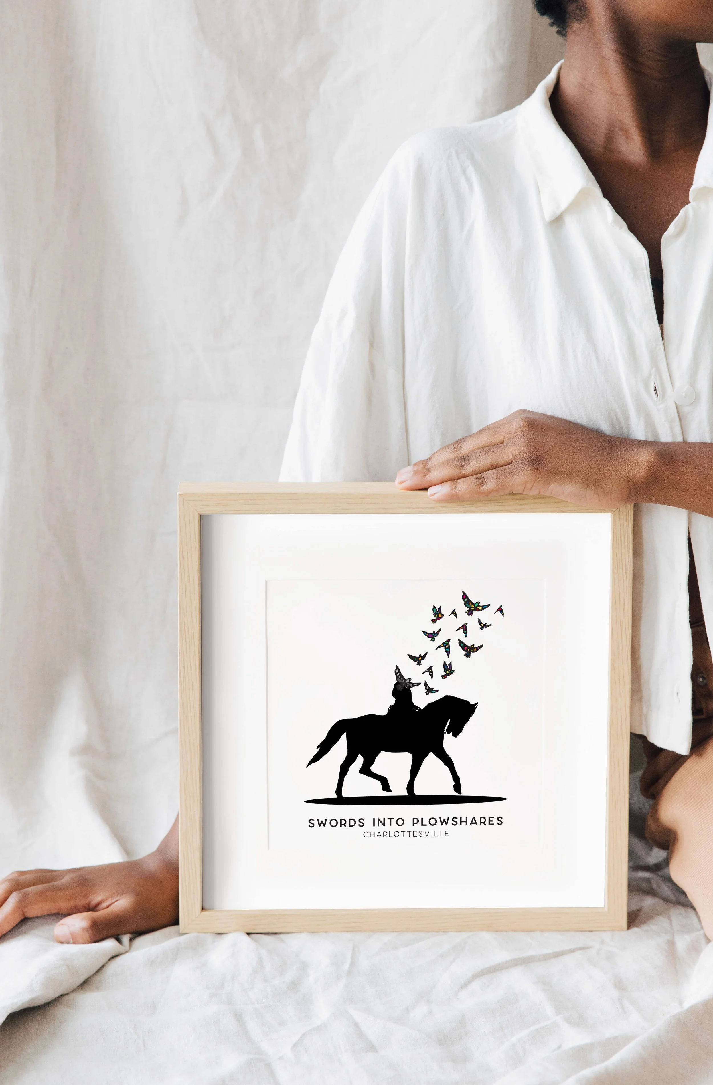


swords into plowshares
Swords Into Plowshares is an innovative project led by the Jefferson School African American Heritage Center and the Memory Project at the University of Virginia's Karsh Institute of Democracy to melt down the Shrady-Lentelli 1924 monument of Robert E. Lee that formerly stood in one of Charlottesville, Virginia's public parks and use the bronze to make a new work of public art that turns historic trauma into an artistic expression of democratic values and inclusive aspirations.
StickyNote Creative collaborated with the project team leaders to create a visual mark to capture the project’s vision and the efforts that would be forthcoming. The SIP logo mark is inspired from photographs of the Lee monument, rendered as a silhouette devoid of color. The artistic transformation that this project seeks to undertake in order to offer Charlottesville and the nation a chance to transform trauma into renewal is signified in the brightly colored stained glass effect birds emerging from Lee’s torso. There is a gradual metamorphosis of the color of the birds – with bold pops of color rising from black and gray – that symbolizes the beautiful and healing nature of the vision when the eventual transfiguration of the bronze statue will be recreated into a new work of public art.
“I am obsessed!! It’s so hopeful!! It’s gorgeous.”
“It’s just beautiful. The stained glass birds are making me cry. I’m not exaggerating.”
birth sisters of charlottesville
Birth Sisters of Charlottesville is a women of color community-based doula collective supporting women of color through their birth journey and into motherhood.
With a mission to dismantle root causes of systemic maternal health disparities for Black, Indigenous, People of Color (BIPOC) while denying race as a risk factor, it was important to develop a brand identity that was culturally responsive, relatable and evoked feelings of empowerment, community, and strength.
The logo mark seeks to bring the organization’s vision to life and visually portray the motherhood progression. The culturally rooted intentionality behind the design is reflected in the range of melanin skin and hair details while embodying the key themes of sisterhood, connection, unity, community, life, love, and being celebrated and cared for. The color palette was curated to reflect a rich, soft, feminine, earthy and natural existence.
“One of the best decisions we made in the early days of our collective was to hire Bunmi Adeeko Collins as our graphic designer to help create our brand and logo. I recall the process Bunmi outlined that ultimately led us to our current logo and brand. The process was so beneficial in helping us fine-tune who we are and how we want others to see us. Looking back, we realized how necessary that journey was for growth as an organization. We still receive compliments on our logo. Bunmi is a gentle and fierce creative spirit who skillfully captures the essence of a project in ways we could not have imagined”
project rebound
Project Rebound was a special initiative spearheaded by a partnership between the Charlottesville Regional Chamber of Commerce and the Economic Development offices of Charlottesville, Albemarle County and the University of Virginia to engage business leaders to share insights, identify challenges, and build actionable strategies to restore the local Charlottesville economy in the wake of COVID-19.
The Chamber desired a mark that would elevate and promote the project mission within the Greater Charlottesville/Albemarle County community and would be visually recognizable to the businesses of the area. The mark is intended to be professional, simple and energetic while portraying a strong and hopeful feeling.
“Our team has been delighted with Bunmi’s work. She offers a powerful combination of creativity and professionalism, and she has a genius for translating words and ideas into a visual product.”